Cargo - innocence lost
As a group we have decided to focus on this opening. This is because it falls within the same genre that our film opening is going to fall under. We found the shaky use of the camera very clever as it portrays how the woman is feeling. Something that we took from this clip specifically is the idea of huffing and puffing which can be seen in the Cargo clip at 2:20. We are gong to take this idea and use it in our own way.
The widowmaker:
I like how the opening involves a lot of close ups of objects that add a mystery atmosphere. This includes needles, a close up of a face, pills etc. We are thinking of including close ups of tablets in our opening so this is quite related. However, in general i like how they incorporated a lot of close ups to give hints for the film.
The use of handwriting shows us that the film could be quite mysterious and different as normally the titles are very well structured. This is something i liked as it isn't typical for a film like this, it breaks out of what is expected. The lack of colour also gives us an edgy and dark atmosphere for the film as everything blends together as it is all black and white.This lets us suspect that the film is going to be a horror and have quite a gloomy atmosphere.
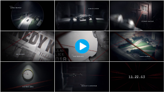
11.22.63
This film opening uses a strong presence of audio to build up the atmosphere. A few hints are given through the images as it explores the location and a man who will probably be the main character. There are sharp cuts to the next item that is being shown each time but the audio helps everything link together which shows the strength of incorporating relevant audio to aid the titles.
Les bleus de ramville
This title sequence stands out from the rest for me as the titles are fitting with the images moving behind them. The colour and position of the titles suit with the background each time in order to incorporate the titles with the sequence starting to build up. This is to make sure there isn't a harsh division between the titles and the film starting. This may seem simple and easy to achieve however it has a great impact on the title sequence.


No comments:
Post a Comment